Merchandising for Bacon Grease band
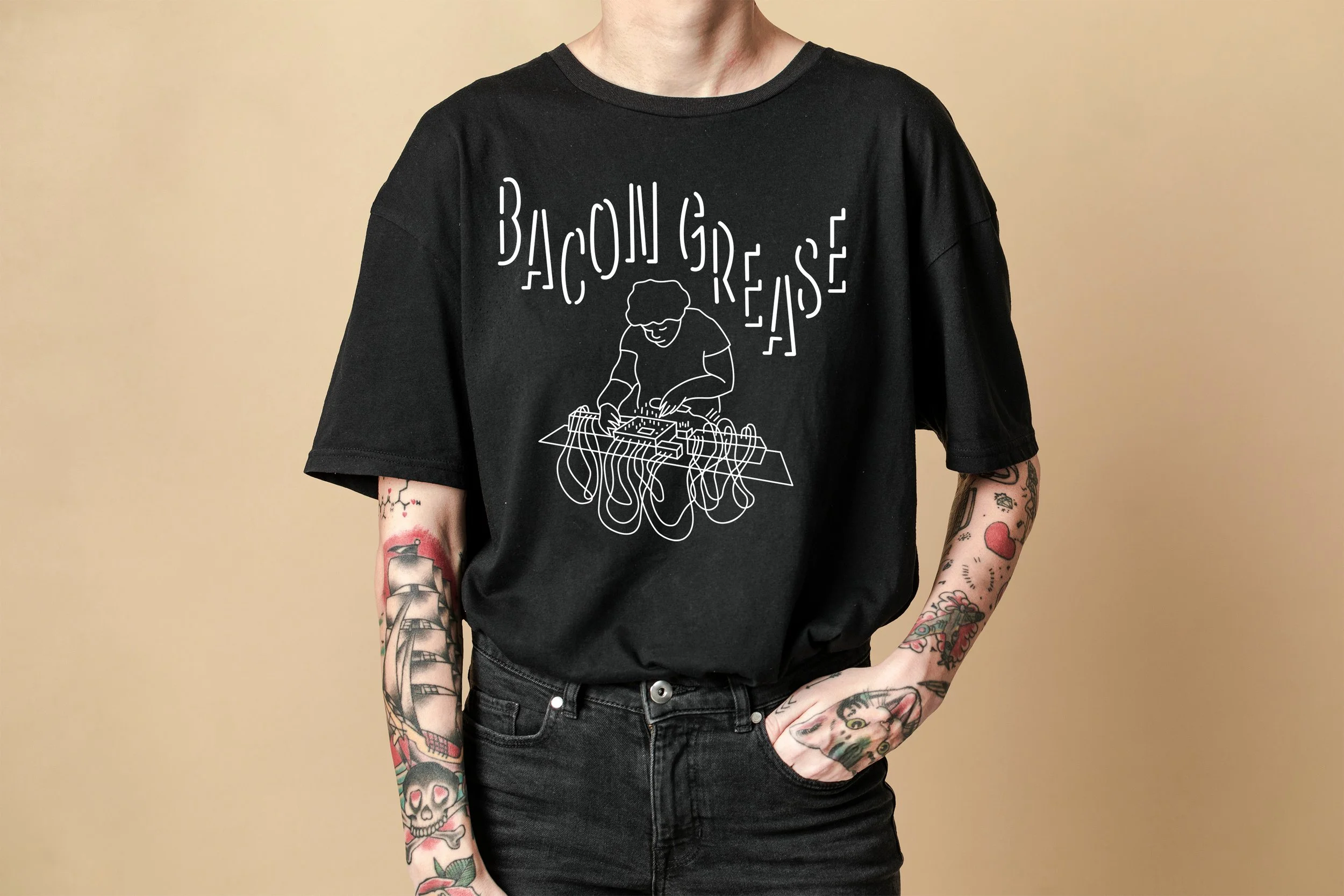
The initial concept for the T-Shirt was based off of a discussion with the client, the idea was to create their outline during a live performance. Drawing inspiration from neon signs, my concept focused on high contrast and connecting line work.
Recalling my first live experience with Bacon Grease, there was an overwhelming setup of gear and wires that came to mind. There were so many wires. This being the nature of seeing electronic music, incorporating the wiring as a central theme in the design would be something that fans could connect to.
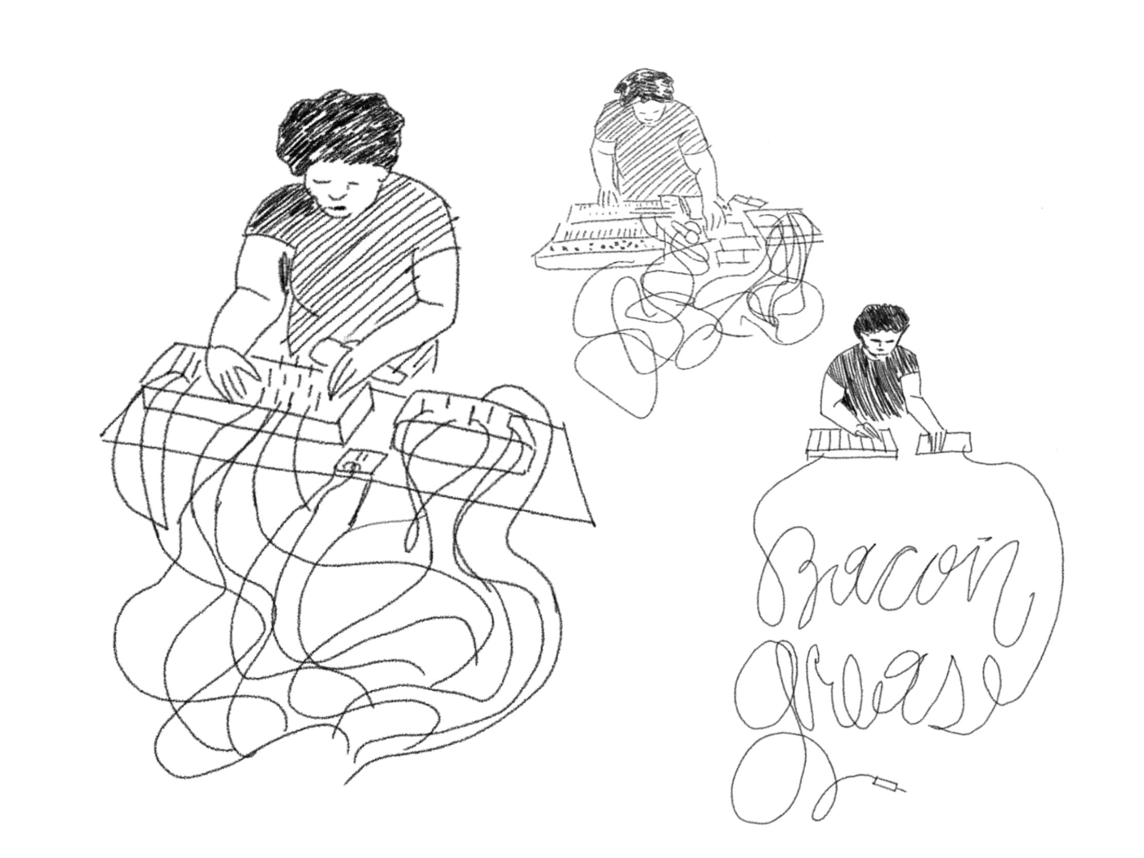
I reflected on the immersive aspects of her live performances, how the beat was built up over time until some kind of order was created out of the chaos of sound. I brought this idea into the design and creating order out of chaos was also my challenge. With these concepts in mind, a few potential designs emerged during the ideation phase as seen below.
An experimental artist in the Orlando music scene, Bacon Grease brings her live performances to diverse audiences.
This project encompassed various forms of merchandise, including T-shirts, stickers, and social media assets to promote upcoming performances.
My role was to create designs tailored to suit their DIY aesthetic and resonate with their listeners. As a fan of their music and the music scene in general, my approach was a made by fans, for fans mentality.

Bacon Grease Uncle Lou’s 2023
The production process was another aspect for consideration. Because the design was to be screen printed, the line thickness was crucial to ensure effective translation to the T-shirt fabric.
The client was very happy with the final outcome and expressed interest in expanding the line of merchandise to include buttons as well which ultimately led to an opportunity to design her next tape deck.
The questions guiding my design process:
Which details overcomplicate the design and should be omitted?
Which details should be included for clarity or inferred?
Answering these questions led me to distill the design down to essential elements and establish a flow within the line work. Special attention was paid to overlapping areas and the negative spaces created. Connecting the cords at the bottom created a dripping effect that really rounded out the structure of the design.


“Concept” Tape Deck Design
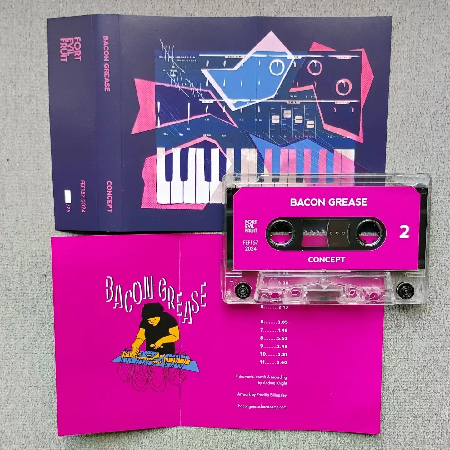
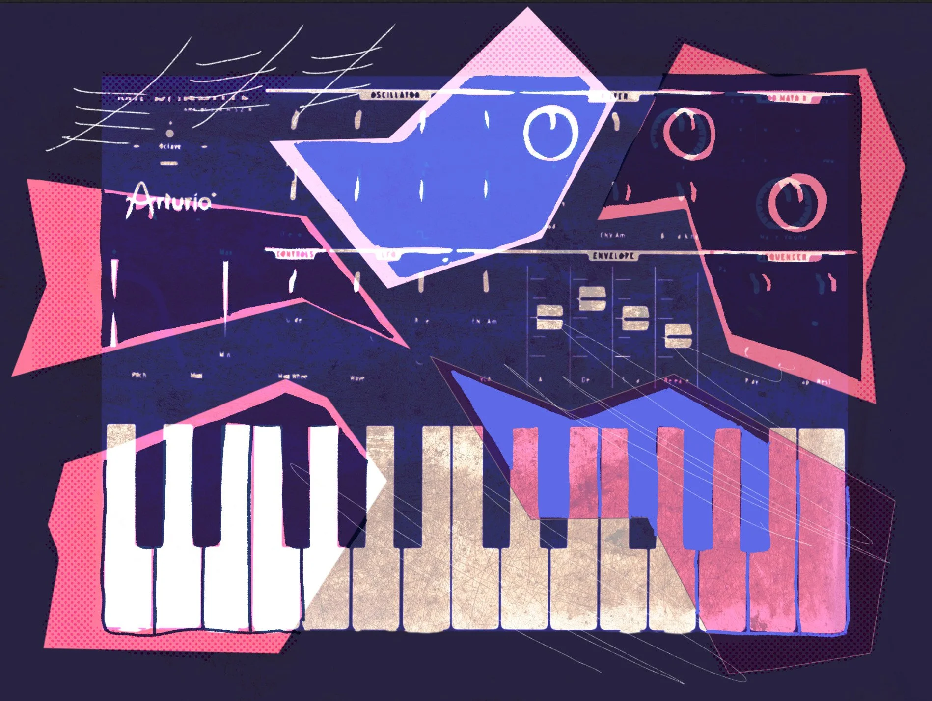
When creating the tape deck design for Bacon Grease’s “Concept” release, we had discussed an abstract take on one of their more admired pieces of hardware, the Arturia MicroBrute Synthesizer. I wanted to depict the sleek technology it in a way that was fractured and gritty to reflect the music itself. The best way to do this would be to start with a photo and expand upon it with hand drawn elements. I decided this design would be a sort of homage to The Wipers “Over the Edge” cover art, and got to work.
Image courtesy of Fort Evil Fruit
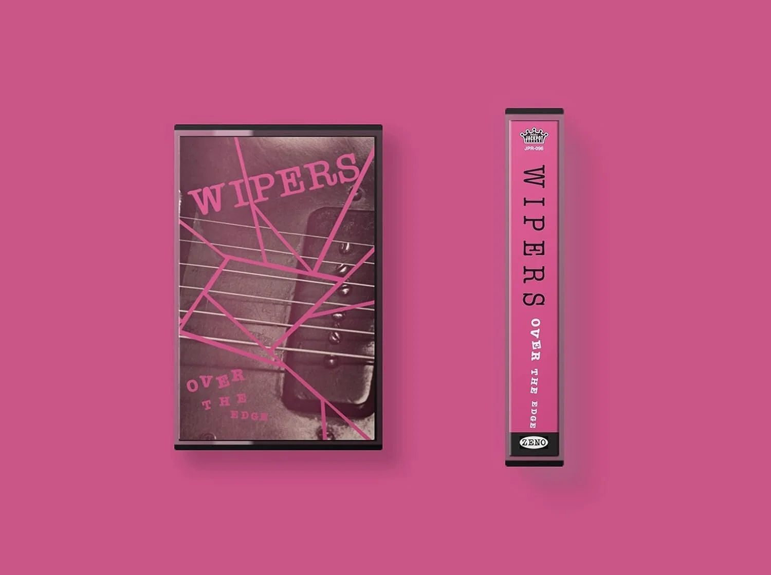
My inspiration when brainstorming the concept.
Tape deck design for Synth-Pop artist Octodaze

Octodaze is an emerging Synth-Pop artist in the Orlando music scene. This cassette tape insert was created in anticipation for their upcoming album release party.
Octodaze’s music is considered the genre of Wave, which incorporates both nostalgic 80’s culture with futuristic technology. With this at the forefront of my mind, my plan was to merge the bold aesthetics of brutalist design with elements of retro-futurism.
To begin this process the client provided me with some assets including an image of the Japanese superhero Kamen Rider to use for the cover, along with their logo, which is a throwback to 80’s dystopian film Robocop.
From there, I paired their previously used typeface of BD Geminis with a bold block typeface, a contrast that could be unified through the use of italics. High contrast color choices were used to reflect the themes of dystopia and Japanese cyberpunk.
The bold colors and retro aesthetics make this tape deck stand out, catching the eye of a passing music fan and preparing them for the sonic experience Octodaze has crafted.
Listen to their music here: Octodaze